Feature
Search Console and GA4, joined on the page, in one dashboard
Search Console knows everything up to the click. GA4 knows everything after it. Kept in separate tabs they each tell you half a story, and the half they are missing is usually the half that matters. Flowra joins them on the page URL and puts a next step beside every number.
The short answer
Google Search Console reports what happened in the search results, up to and including the click. Google Analytics 4 reports what happened on your site, from the click onward. The only thing the two share is the page URL, which is why almost nobody joins them and why a page can look like a winner in one and a failure in the other. Flowra reads both through Google's official read-only APIs and presents them as one dashboard against the same pages, the same topics, the same date range and the same filters, so you can see that a page on page one of Google is holding visitors for fourteen seconds. Then, because knowing is not fixing, the same tool turns that page into a rework task and measures whether the fix worked.
The problem
Two tools, two tabs, and nobody joining them up
Everyone has both of these open. Almost nobody reads them together, because reading them together means exporting two CSVs, matching them on a URL column that is formatted differently in each, and doing it again next month.
So the two tools get used for different jobs, and the question that sits between them never gets asked. Search Console will happily show you a page climbing to position four. GA4 will happily show you a page nobody stays on. It takes both, side by side, to notice they are the same page, and that the ranking you have been congratulating yourself on is sending traffic to something that does not work.
That page does not need more links. It needs rewriting. You cannot tell the difference from either tab alone.
/blog/best-hiking-pants
Search Console
up to the click- Impressions
- 41,200
- Clicks
- 2,840
- CTR
- 6.9%
- Position
- 6.4
GA4
after the click- Sessions
- 2,610
- Engaged
- 31%
- Avg. time
- 0:14
- Key events
- 3
Ranked well. Landed badly. Page 1 of Google, 2,840 clicks, and fourteen seconds on the page. Neither tool can tell you this on its own.
Illustrative figures.
What is in it
Four tabs, one date range, one set of filters
Change the range or the filter once and every tab answers for that slice. No tool switching, no re-exporting, no reconciling two numbers that were never going to agree.
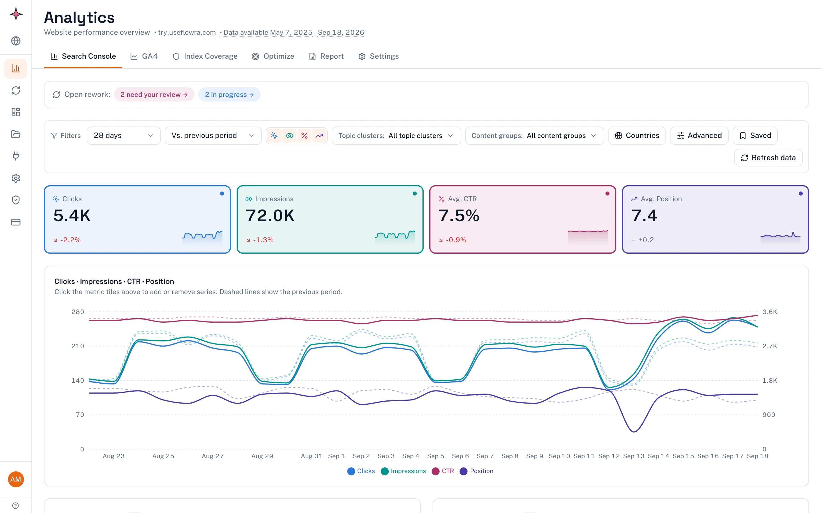
Search Console
Clicks, impressions, CTR and position, with the previous period drawn underneath.
- Queries and pages, paged past Google's 1,000-row limit
- Countries and devices
- Branded vs non-branded traffic, split out
- New rankings: queries you started appearing for
- Query distribution across the positions
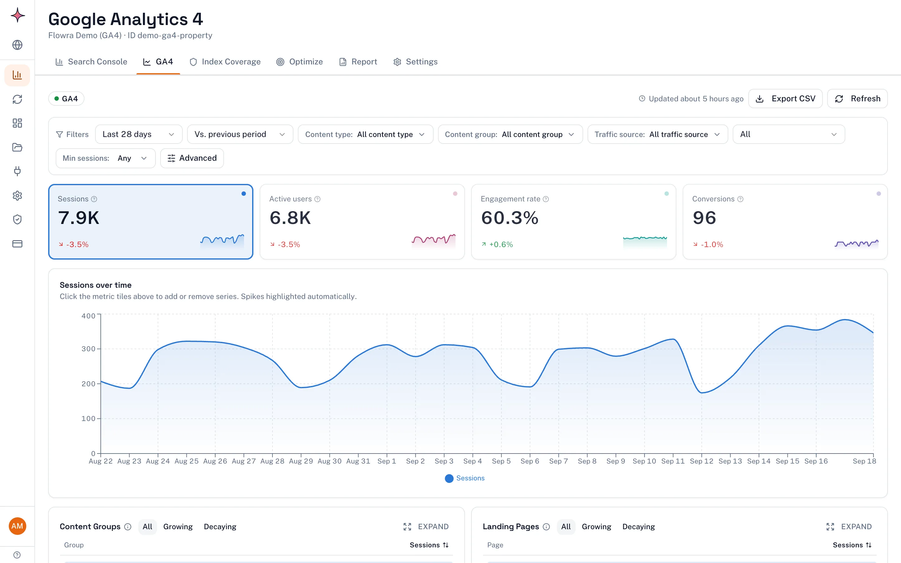
GA4
What the visitors did once they arrived, cut the same way as the search data.
- Sessions over time, landing pages, top pages
- Traffic from ChatGPT, Perplexity, Gemini, Claude and Copilot
- Source and medium, key events
- Content momentum and growth attribution
- Hidden winners: pages doing more than their traffic suggests
Index Coverage
Whether Google has actually indexed the pages you published.
- Indexed and not-indexed, per page
- The reason Google gives, in plain words
- Alerts when a page that was indexed stops being indexed
Optimize
The four reports that turn the dashboard into a to-do list.
- Content Decay Map, page by month
- Striking Distance, positions 4 to 20
- Cannibalization, your own pages competing
- Featured Snippet Opportunities
Cut it your way
Ask the question you actually have, not the one the tool offers
Ranges run from the last 24 hours to the full 16 months Google will give you, and any range can be drawn against the period immediately before it so you are reading a change rather than a number.
On top of that, rules: queries that contain a word, pages under a path, positions inside a band, one country or forty. Save a combination you use every week and it becomes one click next week.
Everything is grouped by theme as well as by URL, so "how is our comparison content doing" is a question you can actually ask.
Range
Theme
Audience
Rules
Every filter applies to both halves at once. Narrow to one topic cluster on mobile in Germany over six months, and the Search Console side and the GA4 side both answer for that slice.
Four things to check in any dashboard
Including this one, and including the one you already pay for
These are the four places a Search Console dashboard quietly loses its usefulness. They are worth checking wherever you end up.
Shows you 1,000 rows and calls it your data
Google's API returns 1,000 rows per request and then stops. Most dashboards send one request. Flowra pages through until Google runs out. One site in testing had 6,738 queries, and a cut at 1,000 does not remove a random thousandth of them: the list is sorted, so it removes exactly the long tail you were looking for.
Lets 16 months roll off the back
Google keeps 16 months and deletes the seventeenth. Flowra pulls your full 16 months when you connect and keeps every day of it afterwards, so a year from now you can compare against a month Google has already forgotten.
Only knows URLs
You do not think in URLs, you think in topics. Topic Clusters work out the themes your pages actually cover, and Content Groups let you impose your own structure on top. A page sits in every group it belongs to, which is usually more than one.
Ends at the chart
This is the real one. A decaying page becomes a rework card with the competitor research attached. A striking distance query becomes a brief. Once the fix ships you tag the change and Flowra measures it against a settling window, not against tomorrow's noise. The dashboard that found the problem proves the recovery.
And then what
A dashboard that hands the work on
Every report in the Optimize tab ends in a button, not a chart. This is the whole difference between an analytics tool and Flowra.
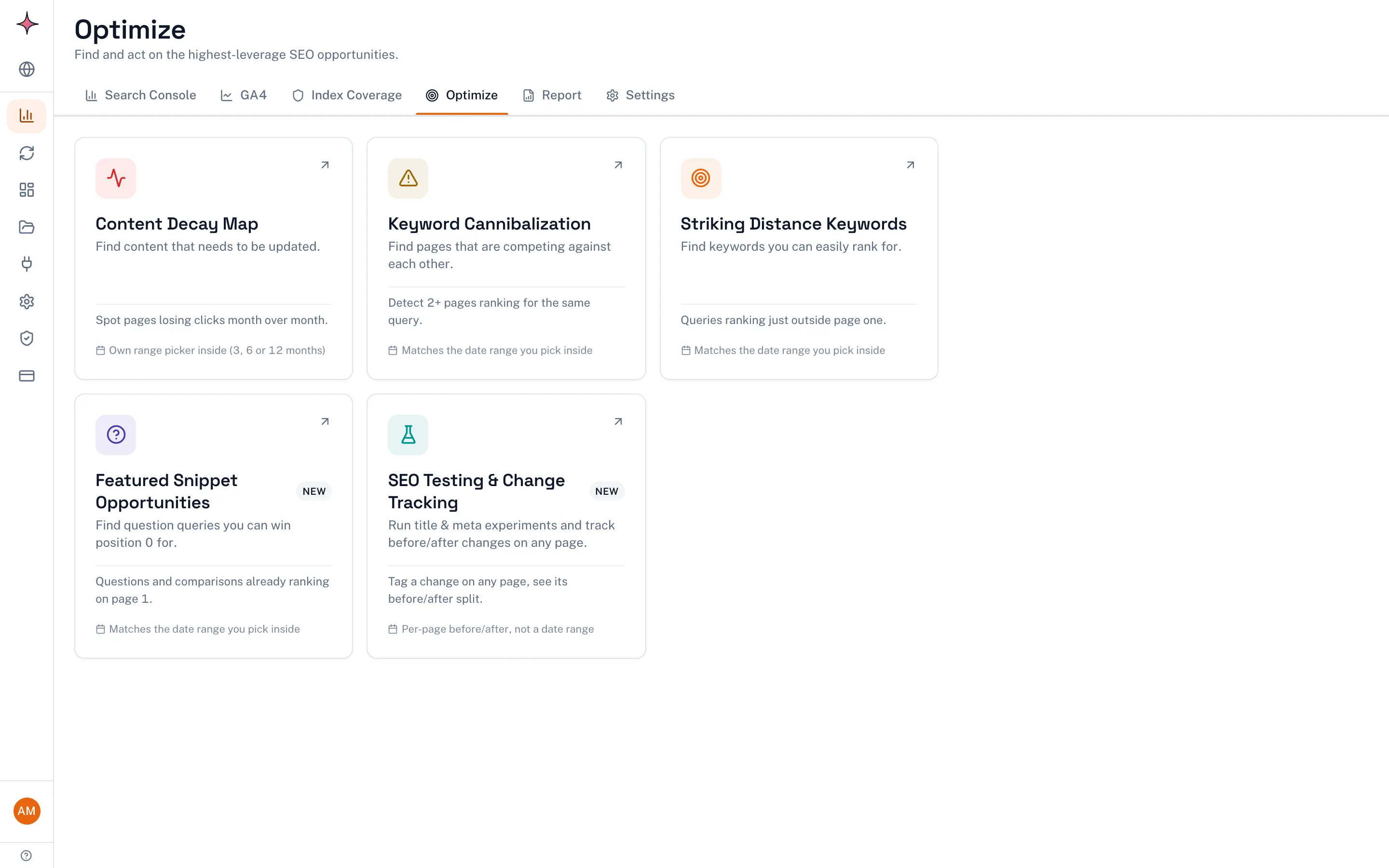
A decaying page becomes a rework card with the competitor research and the section-level plan already attached.
How the decay map worksA striking distance query becomes a brief, with the page it belongs to and the gap between you and page one already worked out.
Try the free calculatorA page AI assistants cite gets its own line in the GA4 tab, so you can see which content is winning where rankings do not apply.
How that number is worked outWhat you get without paying
Connect Search Console on the free plan and you get the headline numbers, the trend chart against the previous period, the content decay report and your top five striking distance queries, on one site, with no card.
The full dashboard, which is the query and page tables, countries, devices, branded traffic, new rankings, topic clusters, content groups and the whole GA4 side, starts at $49 a month on Starter.
See what each plan includesWhat Flowra can and cannot touch
- Search Console access is read-only and scoped to Search Console alone.
- GA4 access is read-only and scoped to the one property you choose.
- Flowra cannot change, delete or submit anything in either account.
- You can revoke both from your Google account at any time without telling us.
Frequently Asked Questions
Search Console and GA4 analytics
See both halves of your traffic on one screen
Connect Search Console in about two minutes. Free, one site, no card.