Feature
Which of your pages are quietly losing traffic, and when did it start?
Content decay never announces itself. Your site total looks flat while a handful of old winners bleed out underneath and new pages cover the gap. Flowra puts every page against every month in one coloured map, so the slide is visible the month it starts.
The short answer
Content decay is an old page losing search traffic gradually, usually over months, while the site total stays flat and hides it. Flowra builds a grid of every page against every month from your Search Console clicks and colours each cell by how it changed against the month before, so a page sliding for five straight months reads as a row going red rather than as a number nobody looked at. It then separates the three reasons a page decays, because losing rankings, losing clicks at the same ranking, and the searches themselves drying up need three different fixes.
The problem
A flat total is the most expensive number in your dashboard
Almost nobody notices decay while it is happening, and the reason is arithmetic. You publish four new posts a month. They pick up a few hundred clicks between them. Over the same period six of your older pages give up a few hundred clicks between them. The total does not move. You conclude that things are steady and carry on.
What has actually happened is that you spent a month of writing to stand still, and the pages you spent years building are being quietly taken apart. Nothing in a standard Search Console view tells you this. The overview chart shows one line for the whole site. The pages table shows this month against last month, which catches a cliff and completely misses a slide.
A page that loses eight percent a month looks fine in every single month. After a year it has lost close to two thirds of its traffic. The month-on-month comparison that most tools show you is the one comparison that cannot see it.
So decay is not really a measurement problem. The data has been in your Search Console account the whole time. It is a shape problem. You need to see a page's whole history at once, next to every other page's, before the pattern is visible at all.
What you see
Every page, every month, in one picture
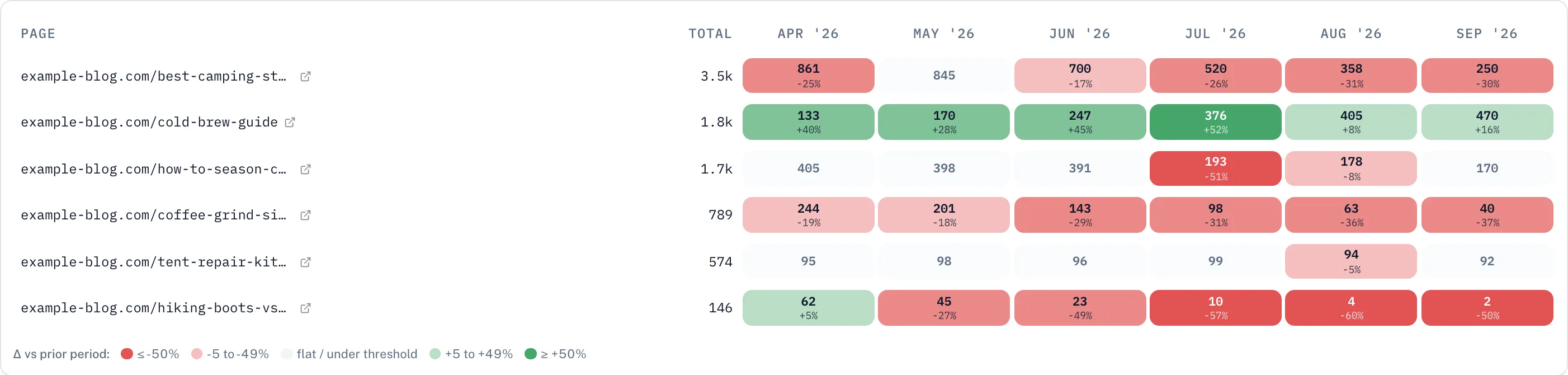
One row per page, one column per month, one cell per page per month holding the clicks it earned. The number in the cell is the traffic. The colour of the cell is something else entirely, and it is the part that does the work: the colour is the change against the month immediately to its left.
That separation is the whole idea. A big page and a small page are coloured on the same scale, because a thirty percent fall is a thirty percent fall whether it is thirty clicks or three hundred. Your biggest pages stop drowning out the rest, and a row that is going red reads as going red no matter how much traffic it started with.
Read across a row and you get the page's story. Read down a column and you find the month something happened to a lot of pages at once, which is usually a Google update, a site migration, or something you did to a template.
Three tabs sit above the grid: Decaying, All pages, and Growing, each with a count. Most people live in the first one. The third is worth more attention than it gets, because the pages that are climbing tell you what to write next.
Content decay map
| Page | Apr | May | Jun | Jul | Aug | Sep |
|---|---|---|---|---|---|---|
| /best-fishing-rod-guide | 812 | 840 | 793 | 611 | 452 | 318 |
| /how-to-tie-a-clinch-knot | 402 | 396 | 389 | 384 | 190 | 174 |
| /camping-checklist-2024 | 265 | 240 | 198 | 141 | 96 | 61 |
| /fly-fishing-basics | 120 | 131 | 168 | 244 | 372 | 401 |
| /coffee-grind-size-chart | 96 | 94 | 97 | 95 | 98 | 93 |
| /hiking-boots-vs-trail-runners | 58 | 61 | 44 | 22 | 9 | 4 |
In the product
What it looks like in the product
Six months across, the newest month on the right. The row second from top grew in every month of the window, which is the case for reading this report even when nothing is on fire. The bottom row went from sixty-two clicks to two, and the month it began is visible at a glance rather than buried inside a two-period comparison. The leftmost column is coloured too, because it is compared against the month before the window opens.
How it reads
What the colours mean, and where the line between flat and falling sits
There are four bands of red and four of green, and they are cut at the same places in both directions: under five percent, five to nineteen, twenty to forty-nine, and fifty or more. Anything inside five percent either way is treated as flat and barely tinted, because a page moving three percent is not moving, it is breathing.
A page is labelled decaying when its most recent month is down more than five percent on the month before, growing when it is up more than five percent, and flat otherwise. That threshold is deliberately low. It is a shortlist, not a verdict, and the job of the map is to make you look at the row rather than to decide for you.
One small detail matters more than it sounds. The first column of the grid is compared against the month immediately before the window opens, not left blank. Most tools cannot colour their first column at all, which quietly hides the very drop that made you open the report in the first place.
Pages with no clicks at all in the whole window are dropped before you see the grid. They are not decaying. They never arrived.
The ordering
Worst first means worst, not steepest
Sorting decaying pages by percentage lost puts garbage at the top. The single worst performing row on a percentage basis is nearly always a page that went from two clicks to zero, which is a hundred percent drop and worth nothing to you.
So the ranking multiplies how far a page fell by how much traffic it had to lose, on a logarithmic scale. Volume counts, with sharply diminishing returns, which is what stops one enormous page from occupying the entire top of the list.
Worked example
The list you get is therefore closer to a list of what you lost than a list of what fell furthest. Those are different questions, and only one of them is worth your Tuesday morning.
The part that matters
Three reasons a page decays, and only one of them is fixed by rewriting it
Finding the decaying page is the easy half. The expensive mistake happens next, when somebody opens the page, rewrites it, republishes it, and nothing changes, because the writing was never the problem.
Search Console gives four numbers per page: clicks, impressions, click-through rate and average position. The relationship between them tells you which of three situations you are actually in, and Flowra works through them in order rather than treating every drop as the same event.
Ranking decline
- The test
- Average position got worse by 1.5 places or more.
- What it means
- Somebody overtook you. The searches are still happening and you are no longer the answer they reach.
- What actually fixes it
- Structural work. Match the format the pages above you use, add the sections they cover and you do not, deepen the topic, and fix the internal links pointing at the page.
CTR and intent mismatch
- The test
- Position barely moved, but click-through rate fell by 1.5 points or more.
- What it means
- You are still being shown. People are reading your title in the results and choosing something else.
- What actually fixes it
- Title and meta description work, and front-loading the actual answer in the intro. Nothing about the body of the article is the problem.
Demand decay
- The test
- Impressions fell by 25% or more while position held.
- What it means
- You did not lose. The searches stopped. Fewer people are asking the question than were asking it before.
- What actually fixes it
- Freshness. Update dated references and statistics, bring in the current year and recent examples, replace sources that have aged out. Rewriting the argument will not bring back searches that are not happening.
The third one is the one nobody checks, and it is the one that wastes the most work. A page can hold position three for a year and still lose half its traffic, because the number of people searching for that thing halved. Seasonal topics do it every year. Products go out of date. A question gets answered on the results page itself and the clicks stop arriving even though the rankings never moved.
Rewriting that page is not a fix. It is a month of somebody's time spent on a page whose audience left. What helps is freshness signals if the topic is still alive, and an honest decision to let it go if it is not.
When a page does clear the bar, Flowra does not just flag it. It carries the diagnosis into the rework queue with the specific angle attached, so the person who picks up the card is told which of these three they are dealing with before they start writing.
Looking closer
Clicks or impressions, months or weeks
The card on the dashboard shows six months of clicks. Open the full view and three things become adjustable, each of which answers a different question.
Clicks or impressions. Clicks are what you lost. Impressions are whether you are still being shown at all. Switching a decaying row to impressions is the fastest way to tell a ranking problem from a demand problem with your own eyes: if impressions held and clicks fell, the searches are still there and something about your listing stopped winning them.
Months or weeks. Months are the right unit for spotting a slide. Weeks are the right unit for pinning down a specific event, because a monthly cell smears a Google update across four weeks and a weekly column puts it on a date you can line up against your own deploy history.
Three, six or twelve months. Twelve is where seasonality becomes obvious, and it is worth looking before you declare anything dead. A page that collapses every August and recovers every September is not decaying, and the six month view will absolutely convince you it is.
The summary table underneath adds the comparison the grid cannot show in a single cell: the most recent two periods against the two before them, sortable, so a slow bleed separates from a one month blip. Every view exports to CSV, because the client who asks for the evidence wants a spreadsheet.
Do it yourself
How to find decaying pages in Search Console by hand
You do not need Flowra for this. The data is yours and Google keeps sixteen months of it. It is just genuinely tedious, so here is the manual route, both because it works and because you should be able to check any tool's answer against your own.
- 1Open Search Console, go to Performance, then Search results.
- 2Set the date range to Compare, and compare the last three months against the previous three months.
- 3Open the Pages tab. You now have clicks for both periods side by side, with the difference.
- 4Export to Google Sheets, because the interface will not sort by the difference column in a way you can trust.
- 5In the sheet, work out the percentage change per page, then filter to pages that had real traffic in the earlier period. A hundred clicks is a reasonable floor.
- 6Sort by percentage lost, then read down the list and ignore the tiny pages that show enormous percentages.
- 7For every page that looks real, go back and check its average position and impressions across the same two periods, which is what tells you why it fell.
That gets you one comparison of one window. It will not show you when the slide started, because two periods have no shape between them, and you will have to do the whole thing again next month and every month after that.
What Flowra does is the same job, kept current, with every month visible at once and the reason for each drop already worked out. The data is not secret. The value is not doing this again.
Setup
Two minutes, and your history is already there
- 1Connect Google Search ConsoleOne Google sign-in. No DNS changes, no tracking script, no developer.
- 2Wait for the first syncFlowra pulls your daily page-level history, which is what the map is built from. This runs on its own and keeps itself up to date afterwards.
- 3Open Analytics, then OptimizeThe content decay map is the first report there, already filled in with months of history you have not seen laid out this way before.
The decay map is included on every plan, the free one included, because a tool that cannot show you your own problem before you pay for it is not worth paying for. The rework queue that turns a decaying page into a piece of assigned work is on the paid plans.
Frequently Asked Questions
Content decay
Related
- Traffic from AI assistants, which is one of the reasons a page can lose clicks while holding its ranking.
- Every Flowra feature, including striking distance, cannibalization and the rework queue.
- How the product works end to end, from finding a decaying page to publishing the fix.
- Pricing, including what the free plan covers.
Find out which pages are slipping right now
Connect Search Console and see months of history laid out in one map. Free to start, no card needed.
Start free